Hi! I'm Nels and I'm a User Experience Designer here at CallFire. I'm writing today to talk about some changes that you probably noticed in our website. We are always doing our best to improve the application. When we released the latest version of CallFire we improved contact management, ramped up its capability to make millions of calls at the same time, and much, much more.
We have lots of great new features planned in the future, but in order to accomplish some of our goals, we need to make a few adjustments to our current design. For the most part, not much has changed. Your campaigns and numbers are still accessible through the "Campaigns" and "Numbers" menu items in the main menu. Our "Create" button is bigger and brighter. We have renamed "Lists" to "Contacts", as it more accurately describes this section of the application.

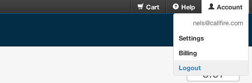
We have moved a few things around too. The account navigation on the top right of the screen has been compressed. Many of the options for "Settings" and "Billing" are now accessible via a dropdown. The title of the dropdown will be your first name, company name, or "Account" if we don't have that information. The "Help" link has also moved up here. As we add additional account management options in the future, they will be a part of this menu.
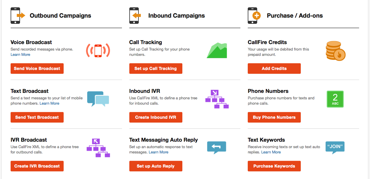
I'd also like to introduce our new "Create" page. All the previous options are available, but now with more color!
We hope that you like the new design as much as we do. We will continue to work tirelessly to make sure you have the best possible experience while using CallFire. Thanks again for your time and I look forward to writing more of these in the future.