by Dinesh Ravishanker
Steve Krug does a great job communicating what he calls “A Common Sense Approach to Web Usability.” The book was not only an easy read, but turned out to be a good reminder of web design basics. Krug delves knee-deep into basic usability but strays from tackling information layout practices and data visualization techniques. Nonetheless, Ed (CallFire’s lead UI Designer) and I took a weekend to rip through it. It should be noted, Don’t Make Me Think has over 540 customer reviews and a 4.5-star rating on Amazon.
 I have been designing websites since high school. Mostly sites with my own with photos of friends, links to music, favorite websites and links to my design work. In time, I began designing websites for neighbors and family. At UC Irvine I helped design a flash video game complete with photoshop graphics of monkeys and flying bananas. Vijesh (our CTO) and I also designed TaxiJet - a flight management system. My first job out of college was with Unisys Corporation, where we designed an in-house website for source code management. Pete (our CIO) and I even designed the UI for many of our previously failed startups including BrainBuy. Later, I had a large hand in the branding, UI design and marketing strategy for DaisyView, AsteriskDialer and of course, CallFire. Long story short, I have designed quite a few sites, so I'm always a little skeptical whenever anyone claims to know anything about design or data visualization. That being said, here are a few things I learned from Mr. Krug:
- 30%-40% of all browser clicks are the back button. Not surprising, but this statistic serves as a solid reminder that there is always room for design improvement. Users should feel like they’re making progress - not hunting.
- Convention is good. Designers and entrepreneurs often become carried away with novel design and incremental improvement. However, using standard conventions can augment speed and heighten a user’s sense of control. Dan (our VP of Engineering) and I recently battled over placing a “Filter” button next to a campaign filter text box. Despite AJAX-style filtering, Dan insisted we keep the button. I argued for a minimalist design - just the text field with light-grey text prompting the user to “begin typing to filter.” Convention won. Why? Little time to test and faith in Google. Despite the popularity of Google’s instant search, Google decided to keep the “Search” button. The lesson: when you can't prove a hunch via R&D, lean on giants who have large usability budgets. (e.g. Google's “search” button is probably there for a reason.)
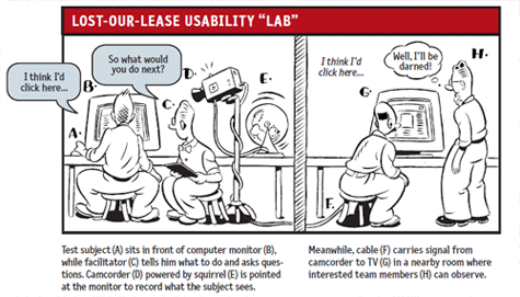
- Capturing video is effective for usability testing. Never tried it. Now that we have Camtasia and Screenflow at the office, we’ll be recording how my 12-year old cousin performs common tasks on CallFire, like buying a phone number or creating a new campaign.
- Successful companies use taglines. CallFire’s original tagline was composed by Pete. The tagline was “Make Contact.” Krug points out several well known brands that use tag lines, despite the fact that they’re household names. The tag lines further cement what your brand stands for. Time for a new one: “Phone Tools for Smart Business People,” perhaps?
The most complex UI I have worked on is Pfizer’s Informacare system - a HIPPA compliant Patient Health website used to manage chronic illness, electronic medical records and health outcomes reporting for large populations. The system was developed by one of the highest-caliber (and well-paid) teams of engineers, designers, researchers and physicians I have ever worked with. Not only did these interfaces touch millions of patients, clinicians and doctors throughout the United States - they were developed using rigorous UX testing, a 15-person QA team, agile-development processes, and countless focus groups. Needless to say, UI design has become second nature to me, but reading Krug’s book reminded me of the basics:
- Omit needless words. Enough said.
- Don’t just optimize for fewer clicks. Instead, optimize for ease-of-click (how easy is it to decide what to click vs. total clicks) which will eventually lead to time savings. Sometimes the non-optimal click solution is the optimal time-saving solution.
- Navigation should naturally communicate your user’s current state. User’s feel more in control and enjoy using interfaces that indicate their location within the system. Use color-coded tabs and controls whenever applicable and useful.
- Use tabs. They also work well when they’re color-coded, cleverly named and easy to read.
- Usability testing is essential. As smart as we all think we are, you’ll learn the most by watching children, at-home dads, power users, and the elderly pound away at your UI.
- Focus groups are not usability tests. Customers can tell you what they want all day long but rarely does that feedback directly result in good design decisions. Listen carefully and make design decisions based on usability tests, not irate feedback.

Krug discusses consumer-facing websites in detail. He hit on the nuances of developing e-commerce websites, the importance of breadcrumbs, navigation and search. I found he could have spent a little more time discussing dashboards and views. We often struggle with finding the right way to view a large set of call data. Since this data is numeric in nature, our customers often require the display of statistics and data visualizations that they find useful.
Ed also pointed out that Krug stresses the need to omit needless words but might want to dedicate more time on omitting needless information. He believes less clutter makes for a more focused user. Many of Krug’s examples are based on data-centric sites but forgoes using any simple websites. A good comparison would be Google’s one-field layout vs. Yahoo’s content-heavy homepage. Ed also had hoped Krug would provide a list of the best sites for user experience, beyond the popular websites he reviewed. Krug lightly hits on the idea that logo design, colors and beauty are important to increasing customer “goodwill”. Though beauty is difficult to quantify, it would have been nice to see some data that supported his theories.
4/5 stars.